Every digital marketer stands to gain valuable insights and improve their campaign results by using A/B testing.
It would be easy to spend all the time in the world testing different variations on your content – which font size scores the most conversions with over 50s in Slough?, you might well wonder. Going in-depth with your A/B testing is tempting, but once you’ve investigated the most crucial variables you will likely fall subject to a law of diminishing returns.
To make the very most of your experiments, aim for major, transferable insights from the word go. Here are four shining examples to point you in the right direction:
Example 1:
Faced with poor banner ad performance in an advertising campaign for customisable laptops, a marketer at Sony Europe used A/B testing via Optimizely to identify the a better approach to improve click-through-rate and shopping cart adds.
The campaign’s existing ads intentionally avoided emphasising the customisability of the laptops. Was this the problem?
To find out, Sony created two new variants of the ad. One placed full emphasis on customisability; the other advertised a promotion. All three were pitted against each other in an A/B/C test.


The results were revelatory, with the first new variant – the personalisation-focused ad – achieving the best results by a significant margin. Compared with the control version, it increased click-through by 6%, and shopping cart adds by 21.3%. If you consider the volume of units Sony Europe sells, it’s not hard to make an educated guess at the value of this insight.
Transferable insights
- It’s especially worth noting that 21.3% increase in shopping cart conversions – customers really appreciate it when their experience closely matches the message on the banner. If your webpage deviates from the message on the banner, prepare for a high bounce rate.
- Prior research had led Sony Europe marketers to believe that emphasising customisability in their ads would put customers off, as the process of customisation might be regarded as a potential impediment to the purchasing process. Split testing is the perfect way to prove or disprove important hypotheses about your marketing – and that’s the key message we want you to take away from this case study. Don’t use it to probe the superficial details; use it to interrogate the philosophy behind your campaign.
- This just goes to show that CRO isn’t necessarily about removing steps from the customer’s journey; rather, it’s about ensuring the right steps are in place.
Promoting personalisation aspects
Never underestimate the power of personalisation. Whether consciously or not, many consumers regard the brands they buy into as facets of their own identity. If the product or experience can be tweaked according to their personal taste, the effect is amplified.
Is there a customisable side to your product or website? User profiles to create? Custom product choices to select? If so, try setting up an A/B test with a variant that places the emphasis on those personalisation aspects – Sony’s success here suggests it’s worth a shot!
Example 2:
Social proof is one of the factors you’ve got to get absolutely right in order to achieve a good conversion rate – especially if some of your visitors are newcomers to your brand.
There are several social proof mechanisms in use around the web, prominently including client testimonials, star ratings, industry authority badges and client logos. Your job is to work out which can do the most to nurture trust in your site and boost conversions.
Media analytics firm comScore used A/B testing to shed light on this very problem. The company’s homepage was already offering social proof in the form of a testimonial, but the element was not displayed prominently, and the source – Microsoft – was not backed up with a company logo.
comScore tested three new variants of their webpage against the original – each with a tweaked design, one of which featured the client’s logo:

The variant displaying the Microsoft logo emerged as the clear favourite of a 2,500-strong audience sample, with a product page conversion rate 69% higher than the original version could offer. The lesson here is clear: if a company like Microsoft is willing to get behind you, you should make a song and dance about it.
Note how much more convincing a testimonial headed with a logo is than the testimonial alone. There are a number of explanations for this phenomenon:
- The logo draws the user’s eye to the testimonial
- It helps to create the sense that the testimonial is official and genuine. You wouldn’t see any other Microsoft communication without the company’s logo at the top, and the same rule should apply here too. To read a message from a brand without any accompanying branding is jarring in most contexts.
- The customer is prompted to associate the brand’s cache (and also its baggage) with your own brand – so be sure to source your testimonials or use logos from sources you would be delighted to be associated with. Take a look at the Target Internet homepage and you’ll notice we’ve done just that, by compiling logos from a diverse range of high profile clients.
Establishing social proof
There’s no such thing as a universal recipe for perfect social proof – every business and every industry differs in its demands and opportunities.
Identifying those demands and opportunities is tricky, but by running a few A/B tests you can steer yourself in the right direction. Here are a few examples of the experiments you might run:
- Products with customer reviews vs products without
- Testimonials with brand logos vs testimonials without
- Testimonial A vs Testimonial B – this experiment is incredibly interesting, as it can tell you a great deal about your customers. Which media source, brand or influencer do they trust the most? Your conversion rates will tell you this in far clearer terms than a survey ever could. The answers to these questions can weigh into your marketing activities more broadly.
- Client logos vs industry regulator logos
- Design-based experiments – which positioning of social proof on your web page works best?
Example 3:
From top-earning mobile gaming apps to influential e-learning apps, ever increasing numbers of digital products and services are being offered first as a basic or trial product, free-of-charge. It’s only when the customer is hooked that the question of payment is raised.
Design feedback experts Unveil use exactly this kind of model – they offer their product for free over a trial period, after which the customer may continue using it by making monthly payments. Unveil ran an A/B test to investigate how removing any references to these payments from their homepage and focusing on their free trial offer would affect conversions:
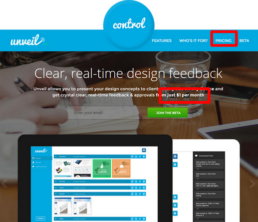
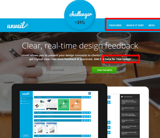
The results of the experiment were conclusive, with the new version yielding 31% more sign-ups than the control.
Should your website mention pricing?
The answer to this question depends entirely upon the type of products or services you’re selling.
If your site is an online shop, you should almost certainly be listing a price next to each item in Shop view and on product pages. That’s simple enough, but what’s less clear is whether listing prices next to featured products on your homepage will help or hinder your conversion rate? A/B testing will give you a good indication of the answers to this and other questions of a similar nature.
For service providers, the issue is more complex. Some prospective customers may be discouraged if they see your prices before they are fully convinced they want to work with you; others may be frustrated if they have to struggle to find information on your rates.
If you are selling a single, digital product or service and offer a free trial period or basic version, Unveil’s successful A/B test would suggest that foregrounding your free offer and banishing mentions of pricing to deeper pages may help to increase engagement.
Example 4:
Which of these sign-up form designs achieved the best conversion rate?
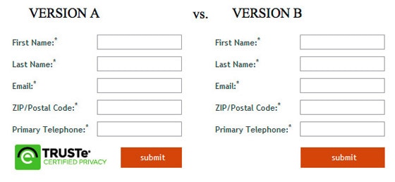
You may be surprised to learn that the victor – by a not-insubstantial 12.6% – was the second version; the version without the TRUSTe security badge.
Earlier we discussed the importance of establishing trust – but once the customer has already decided they trust the brand enough to consider signing up, they probably don’t need to see a security badge when they reach the sign-up form. The badge will simply clutter the design and complicate the user’s thought process – they may even be prompted to question whether or not they really do trust the company.
This seems clear enough with the benefit of hindsight, but at the outset it would be a very difficult issue to spot. Meticulous A/B testing of the key features in your conversion funnel can often unearth surprising results that point to CRO opportunities where you would least expect to find them.
Some extra split testing tips:
- Test one change at a time – testing multiple changes in a single A/B test makes it impossible to identify how each action has affected the results.
- Measure the value of your tests – estimate the monetary value of your A/B tests by measuring conversion rate increases (and the value of those increases) against the cost of running the tests (staff time, app subscriptions, etc.) When you stop making good returns on testing a certain channel, focus your efforts somewhere else for a while. Look for trends in the types of test that are making the biggest difference – this will indicate where you need to target future tests, and may also show you where your marketing needs to improve across the board.
- Share test results with your team – sharing A/B test results with your colleagues can help to encourage a more careful and scientific approach to design and content throughout the team. Everyone should understand that every last pixel of your marketing materials will affect your conversion rates.
- Never stray from your usual practices – remember, however small your sample size, A/B test variants are always delivered to real customers in a live production environment. By all means try something radical in terms of design changes or re-ordering of content, but make sure you never stray from your brand guidelines and established practices – at least not without careful consideration and the necessary clearance. A/B testing is all about finding the small changes that make a big impact.
- Keep an eye on your experiments – it’s always worth monitoring your A/B tests throughout their duration. If it becomes apparent before the test has ended that a new variant is performing very poorly, it may be worth your while to stop the test then and there, to avoid causing further harm to your overall conversion rate.